
(54) Evaluation Q.2
How Effective is the Combination of Your Main Product and Ancillary Texts?
Transcript
When discussing the effectiveness of my main product and my ancillary tasks, it is important to first establish the links between them. For my main product, I opted to produce a 16-minute political drama short film, and the ancillary texts I was required to produce alongside this product was a promotional poster and a magazine article reviewing the final film. The effectiveness of each of these products can be measured by how well they link to the film. The reason establishing a link between the film is important is because it helps audiences identify the film being advertised by looking at any one of these products, therefore, it is important to synergize the ancillary texts with the main product in order to amplify the marketing and publicity of the film in order to gain revenue and/or exposure for the filmmaker.
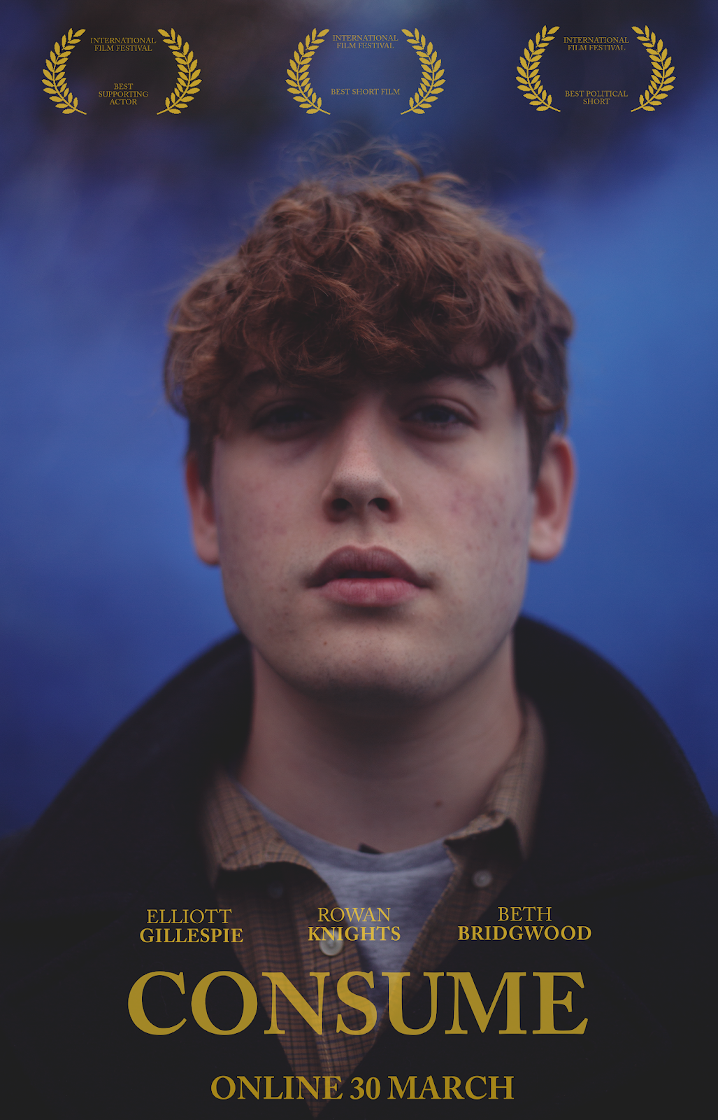
I want to talk about my poster first, as this is the primary method used to advertise my film. First, I want to discuss the similarities between my film poster and my film itself. The first thing anyone notices about a poster is the centrepiece image - this is no different for my final poster which features a large, brightly coloured portrait. The subject of the photograph on the poster directly links to my film because it features the protagonist, Egon. This immediate link to the film is arguably the most noticeable one, particularly as the character features across all of my ancillary texts, but we'll discuss that in more detail later on. When looking at the poster at first glance, the audience will notice the subject and link that with the film. However, assuming that Stuart Hall's reception theory is correct then the audience will do more than just simply look at the poster and notice a very clear link. Reception theory argues that when an audience looks at a media text, they play an active role in interpreting meaning from what they see and are not just passive viewers. With this in mind, then my audience can draw further links by looking deeper into the imagery on the poster. Minute details that hold so much meaning when applying the film's narrative are on the poster, which links effectively. For example, minute details such as the character's expression, which reflects his youthful character as he, after all, represents youth as a whole, which also links to his name Egon, which means 'young fighter'. Another small detail that an active audience would pick up on is the blue smoke in the background of the shot. Blue smoke is one of the driving motifs of the film. The scene it appears in is one that features death, terrorism and hate, therefore, the smoke is an embodiment of this. This feature not only links to the film because blue smoke is incorporated into them both, but it links because of what the smoke represents. The poster can be interpreted how it wants, however, an interpretation I like is that the smoke, surrounding Egon, foreshadows his downfall into hate and tyranny himself, which refers to the end message of the film: that we are all as bad as each other. Whether it be the young man exploring and learning about the world around him and the mechanisms that drives it, the terrorist angry at all he has lost or the tyrant, hungry for power. The blue smoke has a meaning for all and that is how an audience active in interpreting meaning from just one image would view it. The reason I know that reception theory can be applied to poster viewers is based on my audience feedback. I completed a survey in which I asked my respondents to link the poster to the film and several of them drew meanings deeper than surface level, such as the smoke signifying Egon's impending downfall, which shows that whether a poster is simple in design, an active audience will always infer further meaning from it, drawing links that might not have been seen by the naked eye. Another thing I'd like to mention about the image and it's relation to the film is it's colour palette. When colouring the image, I created a faded film effect and removed the greens from the shadow of the image in order to create a purple hue. This is the exact same colour grade I used for the footage of the film, which makes the image seem more accurate to the short film's look. Moving on from the imagery, I'd like to discuss the titles and credits, particularly the designs. Something noticeable about the font is that I have selected a serif font. This is the same font I used in the titles of my film. Likewise, the yellow colour used for the text matches the same colour used in the titles throughout my film, so this draws a direct link between the poster and the film. This use of synergy is effective because it keeps a consistent theme throughout my products and, therefore, helps the audience identify them as the same film. Furthermore, the choice of font and colour is effective on its own because of its elegant look. Unlike blockbuster films, which often rely on bold, sans-serif fonts, independent and artistic films tend to use more elegant designs. This is why I have selected this look, as my target audience will be able to notice this elegant design across all three texts and therefore identify it as a film that might appeal to them. I want to discuss more what is actually written on the poster now. Because short films aren't produced for widescale audiences, they often don't rely on extensive marketing campaigns. I wanted to channel this by taking a more simplistic approach for my poster, rather than one that allows my film maximum publicity. This is the reason I opted not to include any release details other than the release date of the film, for example, there is no use of social media on the poster. Instead, short films rely on prestige among other artists, which is why it is common for awards to be plastered all over a short film poster. This is why I have chosen to include fake awards on my poster as it effectively entices film buffs, my main target audience, into watching my film because they care about how a film performed among critics and film festivals. Similarly, I have included the cast names on the poster in order to directly link it to my film, despite these actors having no prestige in the industry, I felt that this addition added a level of professionalism that is present across all of my products. As an overall product, the poster is effective because it summarises the overall mood and emotion of the film. Furthermore, it establishes a style in filmmaking through the use of elegant design. It also confers much meaning onto the viewer through subtext, making it a subtle and unique poster in it's own right.
Moving on to how my magazine review links to my film, the first thing I'd like to discuss is the overall design of the magazine. As you can see, my magazine is designed to imitate the style of independent film magazine, Little White Lies. The reason this links to my film is that my film is definitely more of an artistic and experimental film than a lot of other short films, particularly student-made short films. Therefore, it's exactly the type of film to be seen in Little White Lies because it suits the artistic nature of the magazine. This is effective because hosting my film's article in Little White Lies is, therefore, reaching my desired primary target audience, film junkies, as they are the main consumers of this magazine. Another link between my magazine and my film is the content itself. For example, the use of screenshots provides a visual representation of my film which draws a direct link to the film and therefore advertises the film visually to the reader. This creative choice is effective because it provides further insight into the film and therefore allows my target audience to decide whether they want to watch the film or not. As I found out in my audience research, the thing people fixate on in my magazine designs is the original illustrations, which feature the characters. In terms of these illustrations, because they're in the artistic style of Little White Lies magazine, it's difficult to establish the link between these and my film. However, looking at the front cover, for example, it shows Bleedingheart in her iconic white dress. Bleedingheart is facing with her back to the camera, which is exactly how we first see Bleedingheart, and how she is seen before being murdered. Bleedingheart is also surrounded by vegetation, which, when applying the idea that audiences draw meaning from texts, can reflect further on her character and peaceful nature. This is why this, as a piece of artwork and a way to advertise the film, is effective; because it engages the audience through eye-pleasing visual imagery, but keeps them intrigued by prompting an active response from them in which they infer meaning from the text. This can be done with all three of the illustrations, for example, the use of smoke and its already established connection to villainy or the curious stance of Egon. By interesting the viewer through images that hold a lot of meaning, it makes them curious about the film. Another thing to talk about that links all three texts together is the use of a quote. 'We cannot let this hate consume us' is one of the most iconic quotes from the film. This is effective because not only does it synergise with the film through its direct link, but it also gives the audience a stronger idea as to what the film is about without having to read the article, making it an excellent creative choice and marketing technique. Similarly, as a standalone article, it is effective. This is because it features a summarised information section where it discloses the cast and crew and involves a simple yet universal rating system based on a 1-5 scale. This is effective because it allows the reader to glimpse at the film before reading the bulk of the article, therefore getting a good idea about the film and allowing to see if they are interested or not as, often, huge chunks of texts can scare away potential readers. Overall, I would say that my magazine feature is effective. This is because it gives the reader many opportunities to learn about the film before they read the article. It also contains colour and eye-catching illustrations that not only grab the reader's attention but also link to the film and infer meaning, allowing the reader to actively engage with the text.
In terms of how effective my products are with a real audience, I can confirm that they are in fact effective. I conducted a survey in which I asked 9 people 4 questions. I asked them to identify, out of four examples of student-made film posters, my film poster. 100% of the respondents selected the correct poster, therefore showing that there is an effective use of synergy across my film poster and main product, as the audience were able to draw clear links between the two. Likewise, I did the same only with my magazine review. 100% selected my magazine review out of the four options available, which, therefore shows how I have effectively produced two products that clearly advertise my film specifically. In my survey, I also asked my respondents whether they thought my poster and magazine looked student-made or professional, to which 100% replied 'professional'. This shows that not only can real audiences identify the links between my ancillary texts and short film, the ancillary texts also serve as a realistic poster and magazine. This is important because this effects how audiences receive them as a professional and appealing poster and magazine is far more convincing as a marketing tool than a tacky or amateur one.
In conclusion, it is fair to suggest that the combination of my ancillary texts and main product is effective. This is because they grab the viewer's attention. Furthermore, assuming that audiences are active in interpreting meanings from texts, according to Stuart Hall's reception theory, then audiences can infer meaning based on the use of colour, design and subject of my ancillary tasks.
Transcript
When discussing the effectiveness of my main product and my ancillary tasks, it is important to first establish the links between them. For my main product, I opted to produce a 16-minute political drama short film, and the ancillary texts I was required to produce alongside this product was a promotional poster and a magazine article reviewing the final film. The effectiveness of each of these products can be measured by how well they link to the film. The reason establishing a link between the film is important is because it helps audiences identify the film being advertised by looking at any one of these products, therefore, it is important to synergize the ancillary texts with the main product in order to amplify the marketing and publicity of the film in order to gain revenue and/or exposure for the filmmaker.
I want to talk about my poster first, as this is the primary method used to advertise my film. First, I want to discuss the similarities between my film poster and my film itself. The first thing anyone notices about a poster is the centrepiece image - this is no different for my final poster which features a large, brightly coloured portrait. The subject of the photograph on the poster directly links to my film because it features the protagonist, Egon. This immediate link to the film is arguably the most noticeable one, particularly as the character features across all of my ancillary texts, but we'll discuss that in more detail later on. When looking at the poster at first glance, the audience will notice the subject and link that with the film. However, assuming that Stuart Hall's reception theory is correct then the audience will do more than just simply look at the poster and notice a very clear link. Reception theory argues that when an audience looks at a media text, they play an active role in interpreting meaning from what they see and are not just passive viewers. With this in mind, then my audience can draw further links by looking deeper into the imagery on the poster. Minute details that hold so much meaning when applying the film's narrative are on the poster, which links effectively. For example, minute details such as the character's expression, which reflects his youthful character as he, after all, represents youth as a whole, which also links to his name Egon, which means 'young fighter'. Another small detail that an active audience would pick up on is the blue smoke in the background of the shot. Blue smoke is one of the driving motifs of the film. The scene it appears in is one that features death, terrorism and hate, therefore, the smoke is an embodiment of this. This feature not only links to the film because blue smoke is incorporated into them both, but it links because of what the smoke represents. The poster can be interpreted how it wants, however, an interpretation I like is that the smoke, surrounding Egon, foreshadows his downfall into hate and tyranny himself, which refers to the end message of the film: that we are all as bad as each other. Whether it be the young man exploring and learning about the world around him and the mechanisms that drives it, the terrorist angry at all he has lost or the tyrant, hungry for power. The blue smoke has a meaning for all and that is how an audience active in interpreting meaning from just one image would view it. The reason I know that reception theory can be applied to poster viewers is based on my audience feedback. I completed a survey in which I asked my respondents to link the poster to the film and several of them drew meanings deeper than surface level, such as the smoke signifying Egon's impending downfall, which shows that whether a poster is simple in design, an active audience will always infer further meaning from it, drawing links that might not have been seen by the naked eye. Another thing I'd like to mention about the image and it's relation to the film is it's colour palette. When colouring the image, I created a faded film effect and removed the greens from the shadow of the image in order to create a purple hue. This is the exact same colour grade I used for the footage of the film, which makes the image seem more accurate to the short film's look. Moving on from the imagery, I'd like to discuss the titles and credits, particularly the designs. Something noticeable about the font is that I have selected a serif font. This is the same font I used in the titles of my film. Likewise, the yellow colour used for the text matches the same colour used in the titles throughout my film, so this draws a direct link between the poster and the film. This use of synergy is effective because it keeps a consistent theme throughout my products and, therefore, helps the audience identify them as the same film. Furthermore, the choice of font and colour is effective on its own because of its elegant look. Unlike blockbuster films, which often rely on bold, sans-serif fonts, independent and artistic films tend to use more elegant designs. This is why I have selected this look, as my target audience will be able to notice this elegant design across all three texts and therefore identify it as a film that might appeal to them. I want to discuss more what is actually written on the poster now. Because short films aren't produced for widescale audiences, they often don't rely on extensive marketing campaigns. I wanted to channel this by taking a more simplistic approach for my poster, rather than one that allows my film maximum publicity. This is the reason I opted not to include any release details other than the release date of the film, for example, there is no use of social media on the poster. Instead, short films rely on prestige among other artists, which is why it is common for awards to be plastered all over a short film poster. This is why I have chosen to include fake awards on my poster as it effectively entices film buffs, my main target audience, into watching my film because they care about how a film performed among critics and film festivals. Similarly, I have included the cast names on the poster in order to directly link it to my film, despite these actors having no prestige in the industry, I felt that this addition added a level of professionalism that is present across all of my products. As an overall product, the poster is effective because it summarises the overall mood and emotion of the film. Furthermore, it establishes a style in filmmaking through the use of elegant design. It also confers much meaning onto the viewer through subtext, making it a subtle and unique poster in it's own right.
Moving on to how my magazine review links to my film, the first thing I'd like to discuss is the overall design of the magazine. As you can see, my magazine is designed to imitate the style of independent film magazine, Little White Lies. The reason this links to my film is that my film is definitely more of an artistic and experimental film than a lot of other short films, particularly student-made short films. Therefore, it's exactly the type of film to be seen in Little White Lies because it suits the artistic nature of the magazine. This is effective because hosting my film's article in Little White Lies is, therefore, reaching my desired primary target audience, film junkies, as they are the main consumers of this magazine. Another link between my magazine and my film is the content itself. For example, the use of screenshots provides a visual representation of my film which draws a direct link to the film and therefore advertises the film visually to the reader. This creative choice is effective because it provides further insight into the film and therefore allows my target audience to decide whether they want to watch the film or not. As I found out in my audience research, the thing people fixate on in my magazine designs is the original illustrations, which feature the characters. In terms of these illustrations, because they're in the artistic style of Little White Lies magazine, it's difficult to establish the link between these and my film. However, looking at the front cover, for example, it shows Bleedingheart in her iconic white dress. Bleedingheart is facing with her back to the camera, which is exactly how we first see Bleedingheart, and how she is seen before being murdered. Bleedingheart is also surrounded by vegetation, which, when applying the idea that audiences draw meaning from texts, can reflect further on her character and peaceful nature. This is why this, as a piece of artwork and a way to advertise the film, is effective; because it engages the audience through eye-pleasing visual imagery, but keeps them intrigued by prompting an active response from them in which they infer meaning from the text. This can be done with all three of the illustrations, for example, the use of smoke and its already established connection to villainy or the curious stance of Egon. By interesting the viewer through images that hold a lot of meaning, it makes them curious about the film. Another thing to talk about that links all three texts together is the use of a quote. 'We cannot let this hate consume us' is one of the most iconic quotes from the film. This is effective because not only does it synergise with the film through its direct link, but it also gives the audience a stronger idea as to what the film is about without having to read the article, making it an excellent creative choice and marketing technique. Similarly, as a standalone article, it is effective. This is because it features a summarised information section where it discloses the cast and crew and involves a simple yet universal rating system based on a 1-5 scale. This is effective because it allows the reader to glimpse at the film before reading the bulk of the article, therefore getting a good idea about the film and allowing to see if they are interested or not as, often, huge chunks of texts can scare away potential readers. Overall, I would say that my magazine feature is effective. This is because it gives the reader many opportunities to learn about the film before they read the article. It also contains colour and eye-catching illustrations that not only grab the reader's attention but also link to the film and infer meaning, allowing the reader to actively engage with the text.
In terms of how effective my products are with a real audience, I can confirm that they are in fact effective. I conducted a survey in which I asked 9 people 4 questions. I asked them to identify, out of four examples of student-made film posters, my film poster. 100% of the respondents selected the correct poster, therefore showing that there is an effective use of synergy across my film poster and main product, as the audience were able to draw clear links between the two. Likewise, I did the same only with my magazine review. 100% selected my magazine review out of the four options available, which, therefore shows how I have effectively produced two products that clearly advertise my film specifically. In my survey, I also asked my respondents whether they thought my poster and magazine looked student-made or professional, to which 100% replied 'professional'. This shows that not only can real audiences identify the links between my ancillary texts and short film, the ancillary texts also serve as a realistic poster and magazine. This is important because this effects how audiences receive them as a professional and appealing poster and magazine is far more convincing as a marketing tool than a tacky or amateur one.
In conclusion, it is fair to suggest that the combination of my ancillary texts and main product is effective. This is because they grab the viewer's attention. Furthermore, assuming that audiences are active in interpreting meanings from texts, according to Stuart Hall's reception theory, then audiences can infer meaning based on the use of colour, design and subject of my ancillary tasks.


Comments
Post a Comment