
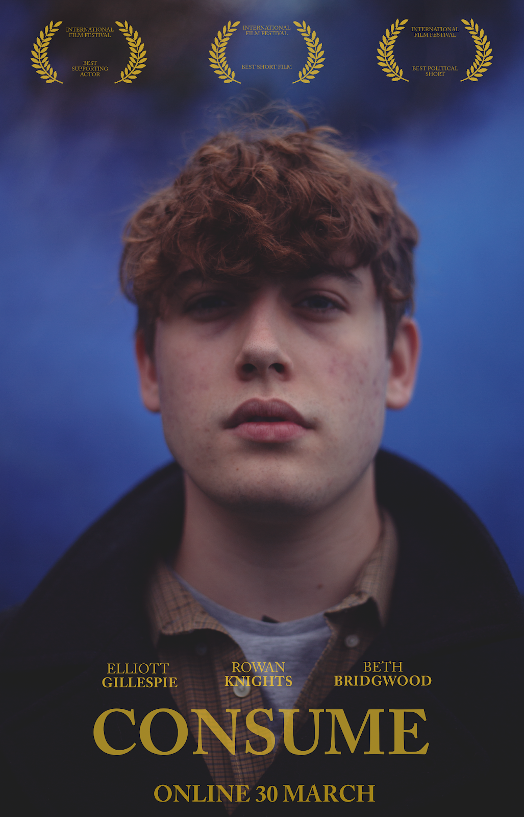
(52) Final Ancillary Task 2
Poster
This is my final poster for my film. To view all of the posters I created, see below.
I have created a multitude of poster designs for my film, using the conventions that I researched here as inspiration. Here are some of the designs I made for the poster for my film:
 These posters are centered around one of the key characters of the film, Bleedingheart. I opted for a teaser-like style for this poster: this style involves little to no information about the
film and only a vague date.
The title is in yellow, the same colour the titles and credits are in the film.
Several (unfortunately fake) awards are included which fits the style of short film posters as, without a-list casts and directors to flaunt, awards are the only thing short film posters have to offer.
I used a mid shot and close-ups to suggest the genre as a drama as it focuses on the character and indicates that the film will be about character experiences.
The color palette is similar to that of my film with cool tones being the predominant colour that comes through with only splashes of warm tones such as yellow and red.
The character expression, I feel, effectively expresses the wide persona of the character. Furthremore, the out-of-focus background briefly shows a lake, which hints at the location of the film and gives a tiny bit of information about the film away.
 The next set of posters I produced were centered around Egon, the protagonist of the film. I designed these posters differently to how I designed the posters that featured Bleedingheart, as I wanted to experiment with different designs before deciding on my final poster. These posters, I have taken a darker approach, however, I think these designs are more accurate to my film. This is because the colour palette suits both the aesthetic and overriding mood of my film. The cool and purple tones and faded film style are how the footage of my film is graded.
Furthermore, I have used a serif font which is used for the titles and credits of my film. Likewise with the yellow font colour. These images feature namedropping of the cast. This is something I initially wanted to avoid as nobody had heard of these names, I thought that adding this feature makes the poster seem more conventional.
The moody expression of the subject reflects the emotional nature of the character, which perfectly links with the film. Furthermore, in the image in which Egon is looking upwards, it indicates his hopeful and curious nature at the beginning of the film.
One of the posters (below) features a billing block. To me, billing blocks are unnecessary, particularly for short and independent films. However, I tried the style out and it made for a conventional look. Furthermore, it transformed the poster from seeming like a teaser poster into a final release poster.
 This set of photos is more unique, however, it directly correlates with the film. This is because the use of the blue smoke denotes to the terrorist scene in my film in which the attacker is wielding blue smoke as a weapon. The reason I have used blue smoke paired with these characters is because of their fall as characters. It can be argued that the Preacher is a terrorist in the way that he subjugates the Riverfolk and incites violence, likewise with Egon at the end of the film.
The cool tones match the aesthetic of the film as the footage is colour graded to look more cool than warm to correlate with its serious themes, I have used the posters to do this too. Furthermore, the use of blue and yellow is effective because blue and yellow are opposite eachother on the colour wheel, meaning they are complimentary colours. The yellow serif font matches the titles and credits seen both at the beginning and end of my short film.
I have framed these images as predominantly mid shots to show the audience that it is a drama film, as this style of portrait (and close-ups) is conventional of drama films. Similarly, I have experimented with different features, including billingblocks, namedropping, awards and even slogans to see what works best for my final poster. I have decided that I prefer the minimalistic style, namedropping, slogans and so on seem unnecassary to me, particularly short films which don't need as extensive a marketing campaign as feature films. Furthermore, the minimalistic style of the poster really corresponds with the minimalistic style of my film.
 This poster is especially unique because it is an illustration. I wanted to experiment with different styles of poster and something that grabbed my attention was classic illustrated posters from the mid-20th century. This poster is modelled after this style, only with my own twist on it.
The use of blue and yellow is synonymous with my film's aesthetic, only in this poster it appears more playful, which is why I haven't chosen it as my final poster because it doesn't fit the serious themes. This poster is very minimalistic, it only includes a title, image and brief mention of the director, which is quite unique for generic film posters however conventional of illustrated film posters.
The poster doesn't include any faces like the rest of my posters, however, it features the back of one of the characters taken from on of the shots in the film, so the image directly relates to the film itself. It also exhibits the dress that Bleedingheart wears, which plays a significant part in the film's imagery.
My last poster is fairly straightforward. I was attempting to channel the style of Christopher Nolan posters, particularly that of Dunkirk with the very muted colours and the wide shots.

This is my final poster for my film. To view all of the posters I created, see below.
I have created a multitude of poster designs for my film, using the conventions that I researched here as inspiration. Here are some of the designs I made for the poster for my film:
 These posters are centered around one of the key characters of the film, Bleedingheart. I opted for a teaser-like style for this poster: this style involves little to no information about the
film and only a vague date.
The title is in yellow, the same colour the titles and credits are in the film.
Several (unfortunately fake) awards are included which fits the style of short film posters as, without a-list casts and directors to flaunt, awards are the only thing short film posters have to offer.
I used a mid shot and close-ups to suggest the genre as a drama as it focuses on the character and indicates that the film will be about character experiences.
The color palette is similar to that of my film with cool tones being the predominant colour that comes through with only splashes of warm tones such as yellow and red.
The character expression, I feel, effectively expresses the wide persona of the character. Furthremore, the out-of-focus background briefly shows a lake, which hints at the location of the film and gives a tiny bit of information about the film away.
 |  |

Furthermore, I have used a serif font which is used for the titles and credits of my film. Likewise with the yellow font colour. These images feature namedropping of the cast. This is something I initially wanted to avoid as nobody had heard of these names, I thought that adding this feature makes the poster seem more conventional.
The moody expression of the subject reflects the emotional nature of the character, which perfectly links with the film. Furthermore, in the image in which Egon is looking upwards, it indicates his hopeful and curious nature at the beginning of the film.
One of the posters (below) features a billing block. To me, billing blocks are unnecessary, particularly for short and independent films. However, I tried the style out and it made for a conventional look. Furthermore, it transformed the poster from seeming like a teaser poster into a final release poster.
 |  |

The cool tones match the aesthetic of the film as the footage is colour graded to look more cool than warm to correlate with its serious themes, I have used the posters to do this too. Furthermore, the use of blue and yellow is effective because blue and yellow are opposite eachother on the colour wheel, meaning they are complimentary colours. The yellow serif font matches the titles and credits seen both at the beginning and end of my short film.
I have framed these images as predominantly mid shots to show the audience that it is a drama film, as this style of portrait (and close-ups) is conventional of drama films. Similarly, I have experimented with different features, including billingblocks, namedropping, awards and even slogans to see what works best for my final poster. I have decided that I prefer the minimalistic style, namedropping, slogans and so on seem unnecassary to me, particularly short films which don't need as extensive a marketing campaign as feature films. Furthermore, the minimalistic style of the poster really corresponds with the minimalistic style of my film.
 |  |
 |  |

The use of blue and yellow is synonymous with my film's aesthetic, only in this poster it appears more playful, which is why I haven't chosen it as my final poster because it doesn't fit the serious themes. This poster is very minimalistic, it only includes a title, image and brief mention of the director, which is quite unique for generic film posters however conventional of illustrated film posters.
The poster doesn't include any faces like the rest of my posters, however, it features the back of one of the characters taken from on of the shots in the film, so the image directly relates to the film itself. It also exhibits the dress that Bleedingheart wears, which plays a significant part in the film's imagery.
My last poster is fairly straightforward. I was attempting to channel the style of Christopher Nolan posters, particularly that of Dunkirk with the very muted colours and the wide shots.


Comments
Post a Comment