Posts
(56) Evaluation Q.4
- Get link
- X
- Other Apps

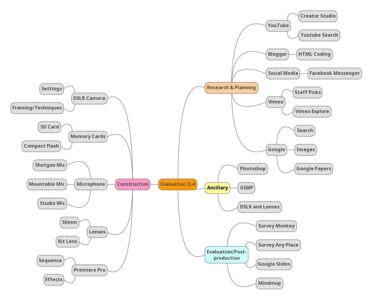
How Have You Used Media Technologies Over The Research, Planning and Construction of Your A2 Coursework? I have used a multitude of technologies over the course of the year. I have created a mindmap listing all of the technologies I have used. I have separated them into which stage of the course I used them in: I have completed a 40-slide presentation detailing why and how I have used these specific technologies, including photographs and examples of my use of these technologies.
(55) Evaluation Q.3
- Get link
- X
- Other Apps

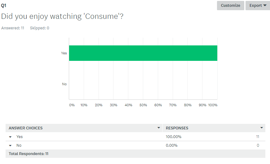
What Have You Learnt From Your Audience Feedback? In order to obtain audience feedback on my short film, I created a survey for people to fill in. The reason I opted to use a survey as a device is that, firstly, it is an anonymous method people can use. This is important because people are more likely to answer truthfully (particularly if they're being critical) when they are anonymous, and I wanted to ensure all of my feedback was accurate to how my audience felt about my film. Secondly, a survey is useful because it is convenient for both me and the respondents as all of their answers are kept in one place and it is a swift and straightforward process, unlike sitting and talking face-to-face or on filling out a written questionnaire. In terms of my focus group, unfortunately, the only people who could respond to the survey were people who had seen my film, which is obviously a limited number of people and, therefore, restricts how representative my results are. I did not want to...
(54) Evaluation Q.2
- Get link
- X
- Other Apps
How Effective is the Combination of Your Main Product and Ancillary Texts? Transcript When discussing the effectiveness of my main product and my ancillary tasks, it is important to first establish the links between them. For my main product, I opted to produce a 16-minute political drama short film, and the ancillary texts I was required to produce alongside this product was a promotional poster and a magazine article reviewing the final film. The effectiveness of each of these products can be measured by how well they link to the film. The reason establishing a link between the film is important is because it helps audiences identify the film being advertised by looking at any one of these products, therefore, it is important to synergize the ancillary texts with the main product in order to amplify the marketing and publicity of the film in order to gain revenue and/or exposure for the filmmaker. I want to talk about my poster first, as this is the primary method used to adv...
(53) Evaluation Q.1
- Get link
- X
- Other Apps
In What Ways Does Your Short Film Use, Develop or Challenge Forms and Conventions of Existing Media Products? Forms, codes and conventions are important to consider and understand when constructing a film, particularly an amateur one. Firstly, there is a reason as to why they are conventional in the first place: they confer a sense of familiarity on the audience. This familiarity is important to help the audience understand something. They can work as short-cuts; by employing something the audience already understands it allows you to build on them to create your own original work. For example, take genre conventions. If you're creating a sci-fi film, you will likely include settings and props etc. that are easily identifiable to the sci-fi genre, such as space or aliens etc. This immediately allows the audience to identify the film as a sci-fi film, therefore, they're almost immediately familiar with the landscape on which your film is set (eg. alien or far away). This means ...
(52) Final Ancillary Task 2
- Get link
- X
- Other Apps

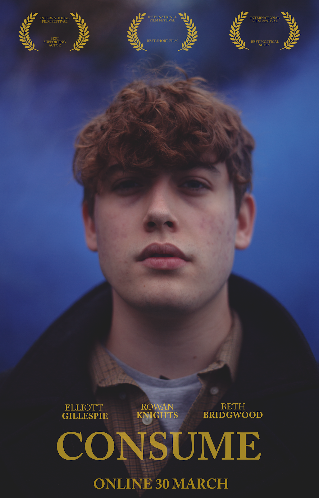
Poster This is my final poster for my film. To view all of the posters I created, see below. I have created a multitude of poster designs for my film, using the conventions that I researched here as inspiration. Here are some of the designs I made for the poster for my film: These posters are centered around one of the key characters of the film, Bleedingheart. I opted for a teaser-like style for this poster: this style involves little to no information about the film and only a vague date. The title is in yellow, the same colour the titles and credits are in the film. Several (unfortunately fake) awards are included which fits the style of short film posters as, without a-list casts and directors to flaunt, awards are the only thing short film posters have to offer. I used a mid shot and close-ups to suggest the genre as a drama as it focuses on the character and indicates that the film will be about character experiences. The color palette is similar to t...

